WALMART INHOME
Agency: Kettle | Role: Art Direction
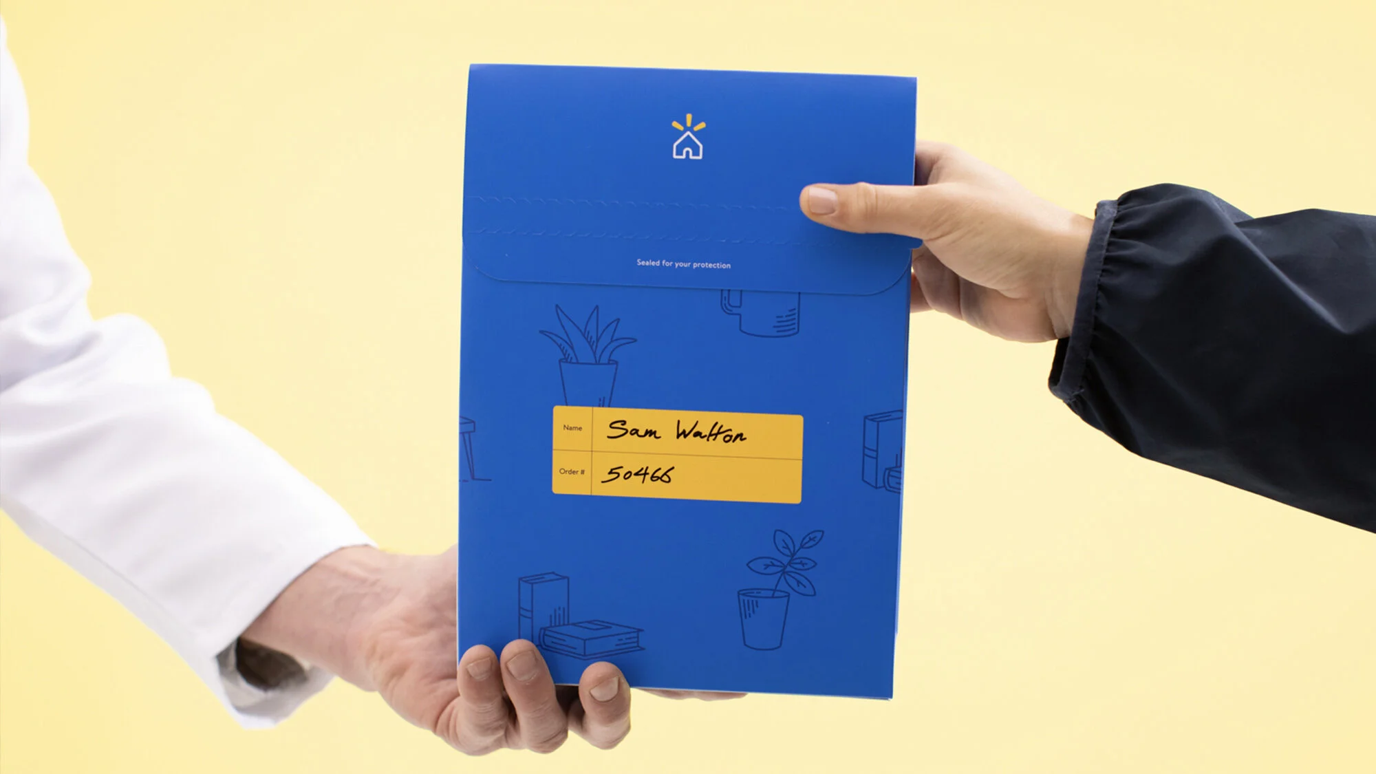
We worked with Walmart to create a vibrant how-to video explaining the mechanisms, customer journey/experience, and ecosystem of Walmart InHome.
OUR OPPORTUNITY
Prove our value to customers at every touchpoint in their lives, delivering on the brand promise of “Save Money. Live Better” with Walmart InHome.
CHALLENGES
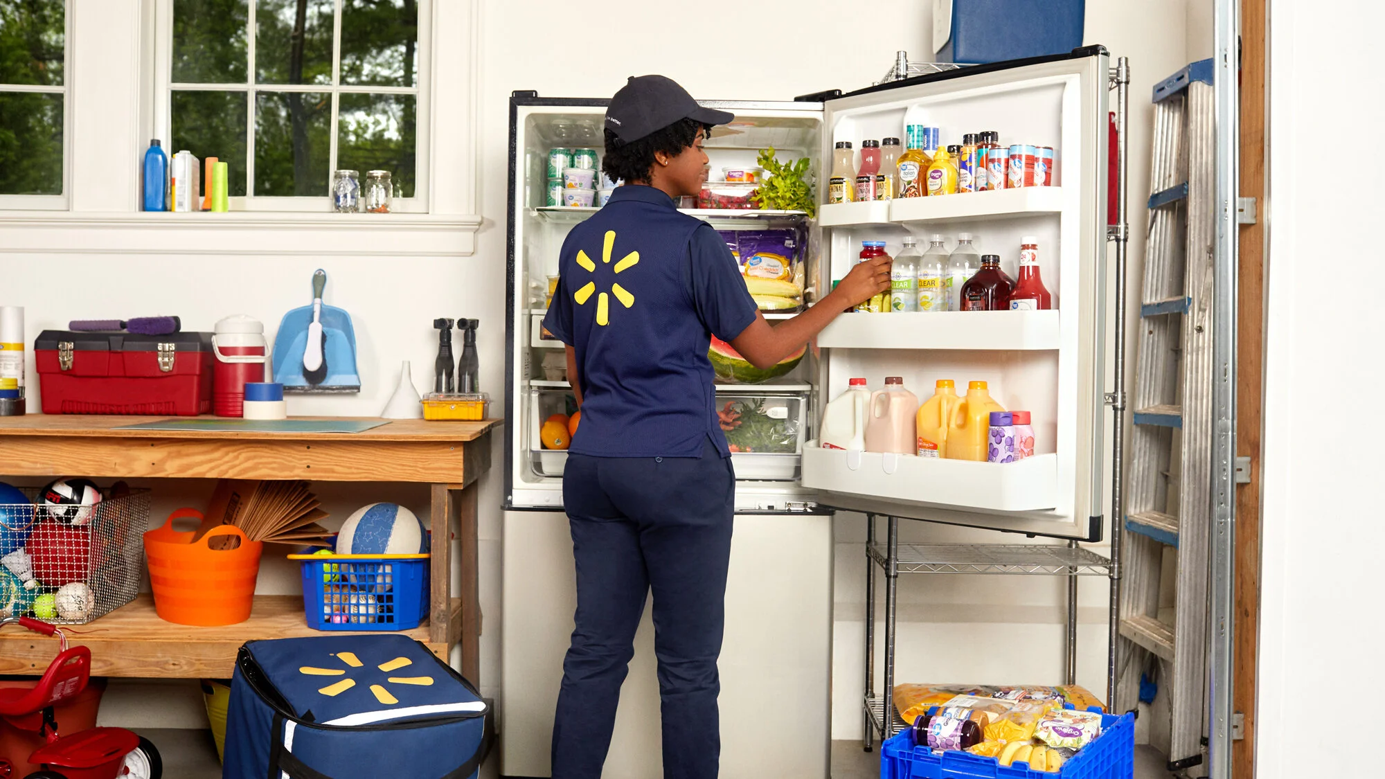
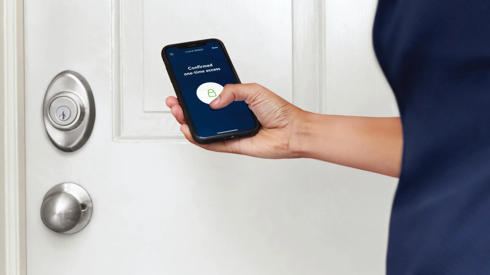
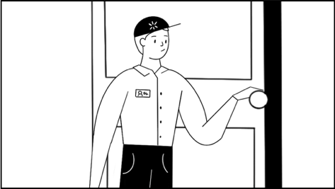
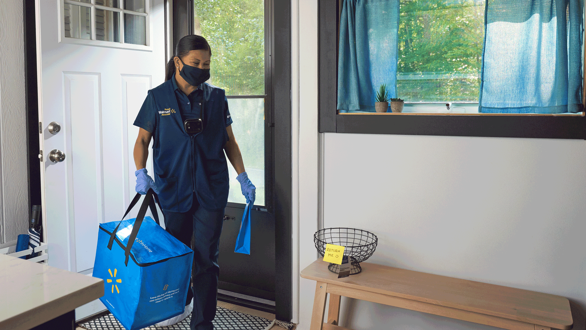
Customers in Walmart’s launch markets don’t know exactly what InHome is, how it works, or how it’s different from Walmart Delivery.
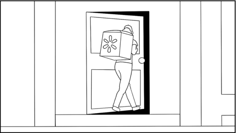
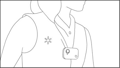
Customers are uncomfortable around letting a stranger into their home.
Customer’s don’t always realize there are two fees: $49.95 installation fee, $19.95 monthly delivery fee.
OBJECTIVES
Drive awareness of InHome offerings and how the service works.
Communicate how InHome is different from regular grocery delivery.
Help potential customers understand the benefits (in order to drive new customer acquisition.
SUCCESS
Measuring success.
Brand Tracker: Walmart InHome perceived as “innovative,” lifts in brand recall, clarity of product, and intent to buy.
Behavioral: Increase in sign-ups for InHome.
ILLUSTRATE + ANIMATE
We chose to create an animated explainer video.
One that’s full of information, and fun to watch.
One that explains the bigger picture, and dives into detail.
And most importantly, one that convinces people to sign up.
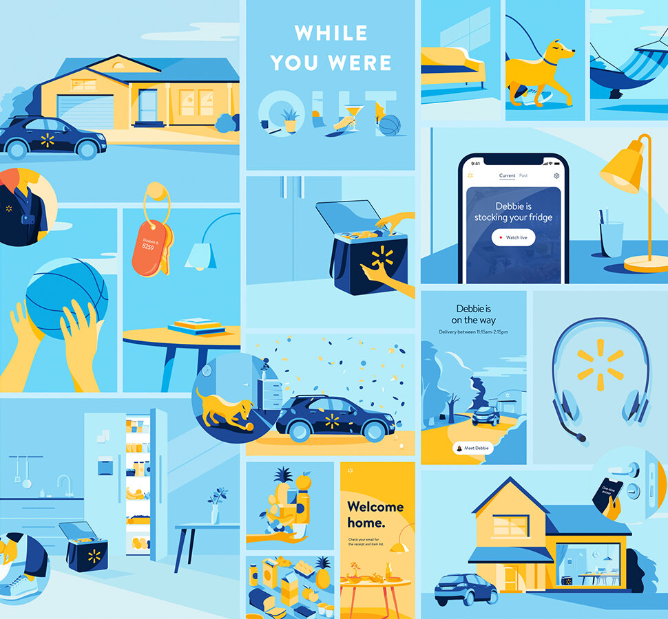
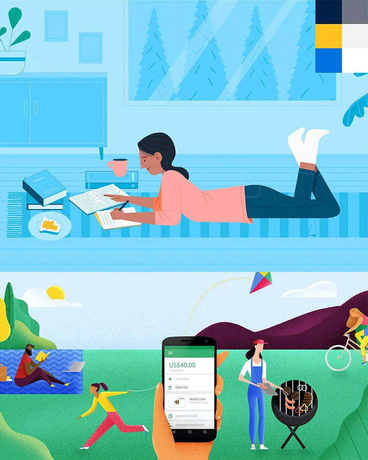
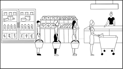
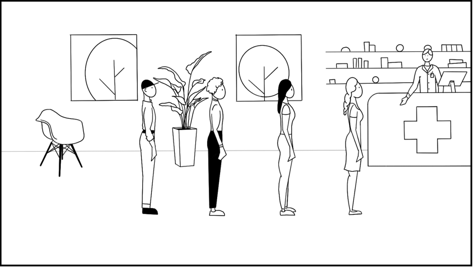
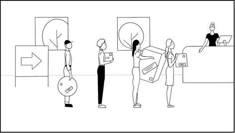
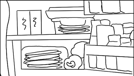
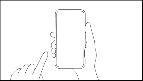
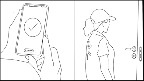
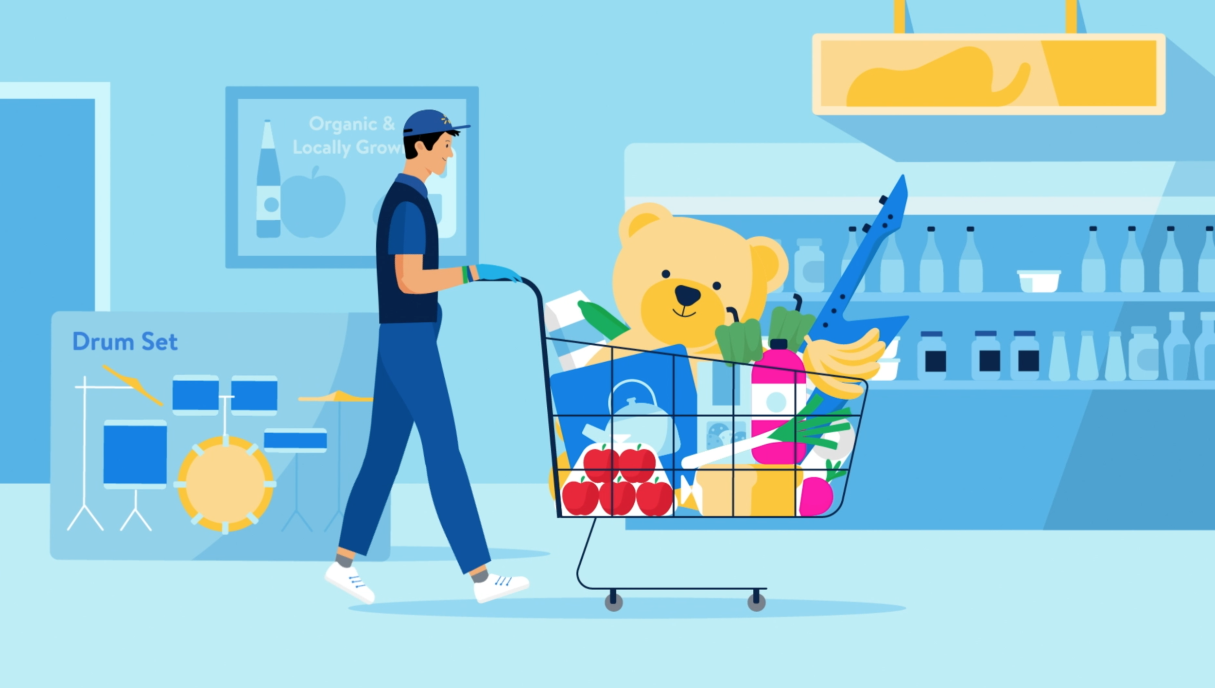
Current InHome Illustration Overview
We wanted to evolve the existing InHome illustration style which initially was comprised of vector illustrations, had a strict blue and yellow spectrum, kept to realistic proportions, showcased the InHome user journey, included full scenes and silhouettes, cropped character elements (like hands, feet, and faces), and lacked fully defined characters (facial expressions, emotional connection).
ART DIRECTION
Human • Simple • Joyful • Whimsical
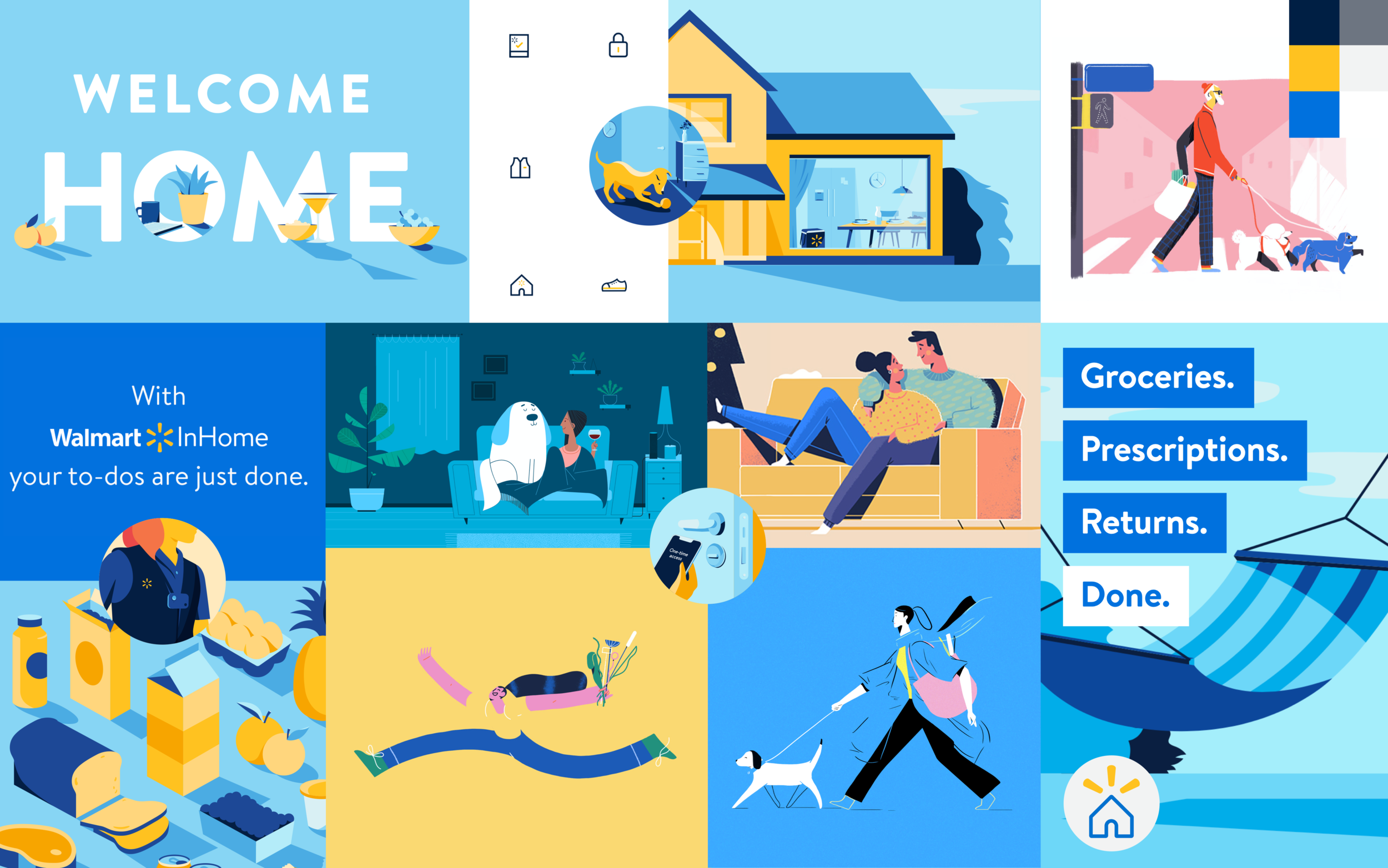
EVOLVING THE STYLE
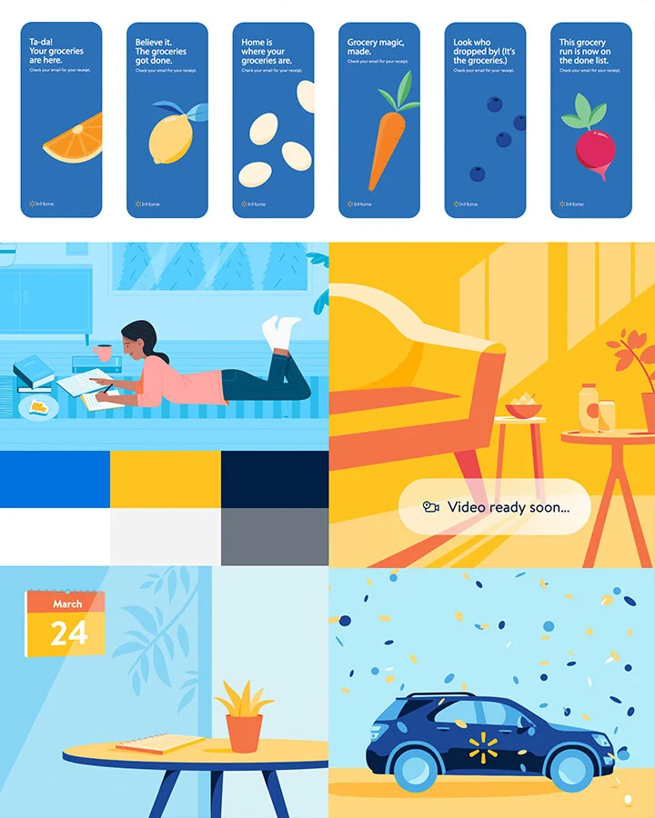
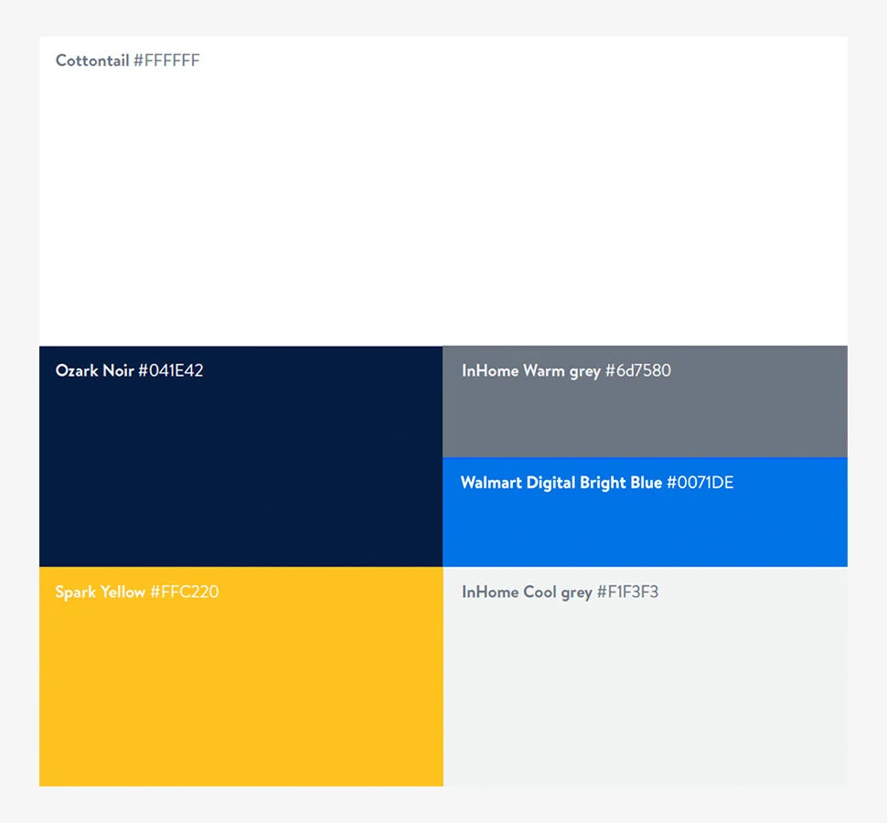
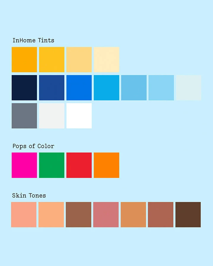
Color Palette
Prioritize Walmart InHome brand colors and tints (i.e. blues, yellows, and grays) to create a consistent brand feel.
Incorporate a secondary color palette (i.e. orange, green, magenta, etc.) to be use sparingly to add detail and realism to scenes.
Add a skin tone range to include a human touch.
Typography / Supers
Use existing Walmart typeface (Bogle) and current type treatments (overlay bars / kinetic type) to provide a consistent art direction across Walmart InHome content.
Utilize simply, punchy, and bold supers to quickly communicate.
Continue to use our established Walmart InHome lockup.
Use bold, simple type overlays on top of illustration to create supers, specifically in our :30 and :15 second cut downs for social (as most people will scroll without sound).
Ensure that the supers are legible on top of the illustrations by thinking of limited color stories for each scene, with low contrast so our supers can pop.
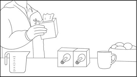
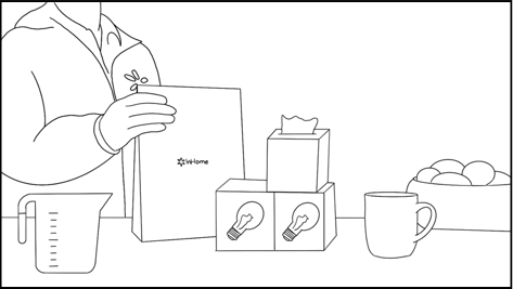
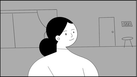
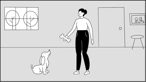
Character Development
Further humanize the characters by introducing several skin tones into our color palette and adding subtle facial expressions to convey the emotions our characters are feeling.
Add whimsical elements that bring delight and make the generic feel unexpected.
Keep characters realistic and proportionate.
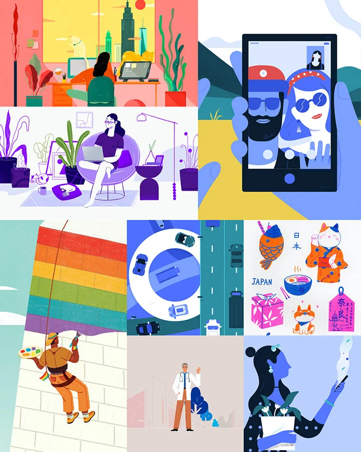
Illustrator (Amelia Chen)
Vector / hand drawn illustration style.
Whimsical nature to her work.
Style has character.
Realistic / proportionate scenes.
Color Palette
Overall, our intention was to keep the video monochromatic, within the yellow + blue world of the brand.
We added pops of color throughout but keeping that palette minimal. Also, introducing a variety of skin tones for our characters.
Animation Benchmarks
Quick, punchy, and to the point text.
Fluidity between scenes with transitions only illustration and animation can provoke.
A consistent, whimsical, and lighthearted energy throughout the story.
THE IDEA
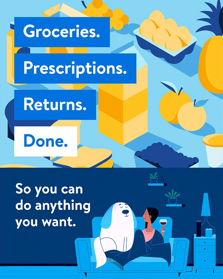
When you have Walmart InHome, your to-dos are taken care of. We’ll show just how monumental this is and explain the ins and outs of how Walmart InHome works, so people know exactly what they’re signing up for.
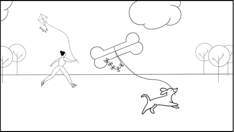
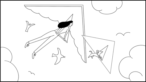
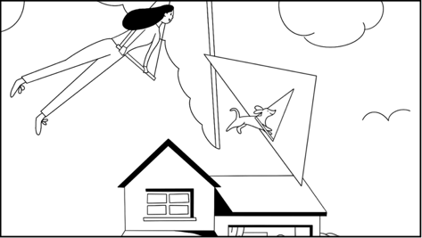
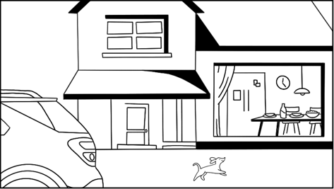
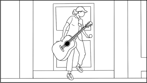
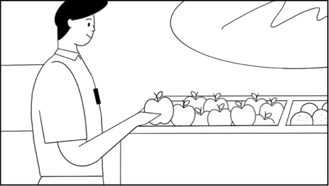
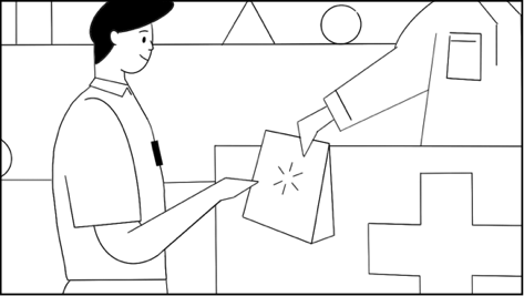
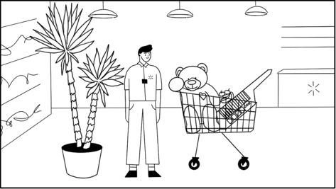
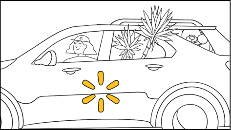
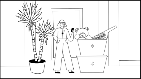


Initial storyboard sketches by me.
DO FEWER TO-DOS
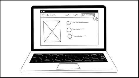
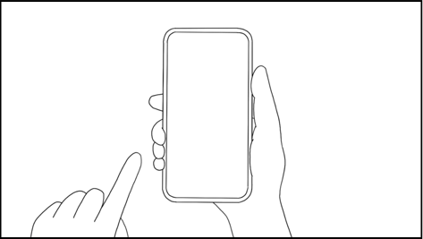
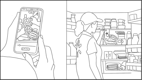
Explainer Video (60-sec)
ANIMATED VIDEO
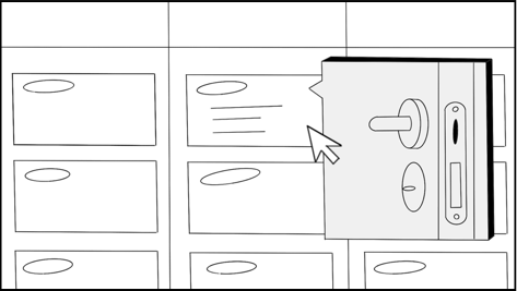
BANNER ADS
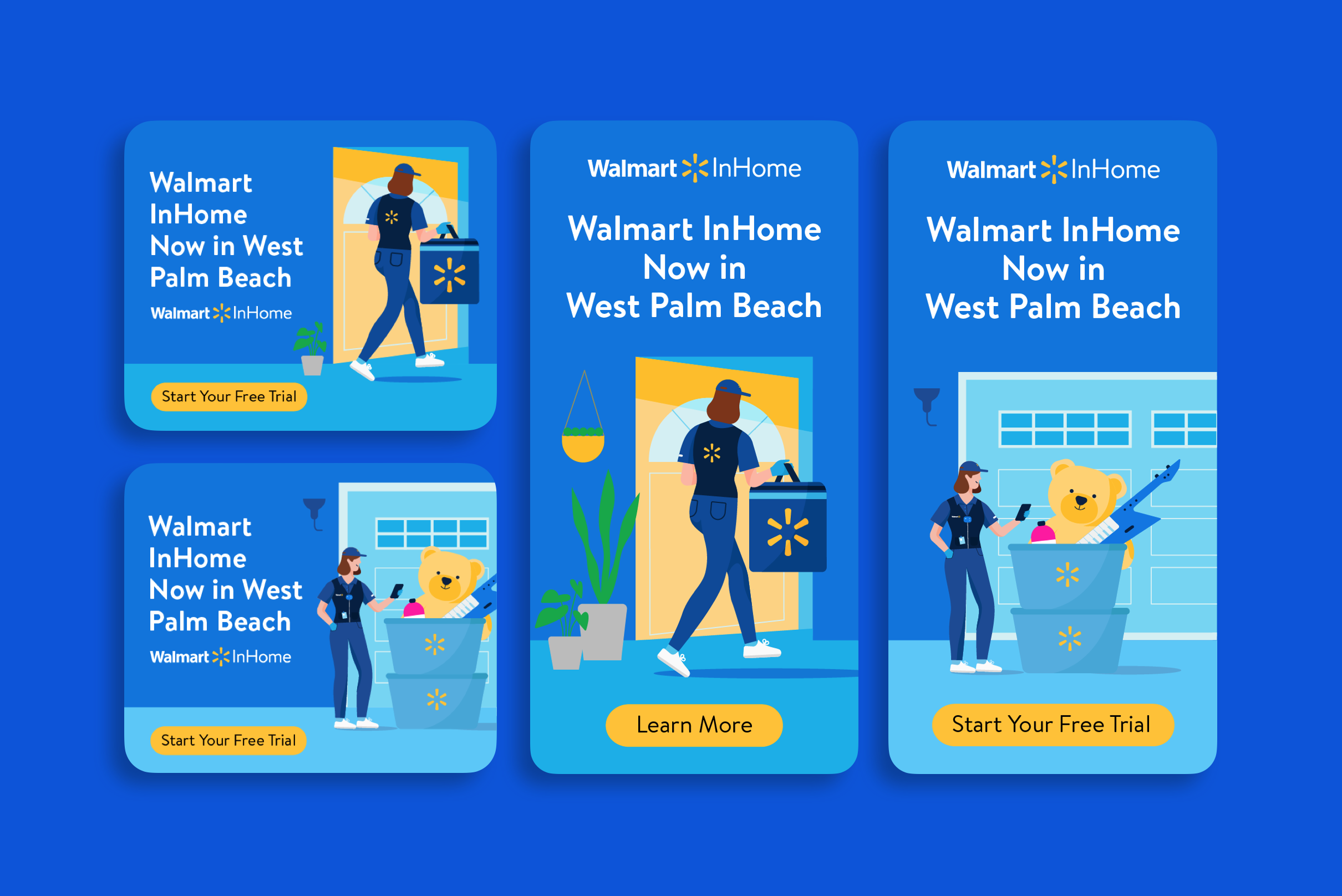
GIF OFFERINGS
CREDITS
ACD Copy: Zak Stawski
Art Direction: Alyssa Buono
Illustration: Amelia Chen
Motion: Hugo Marmugi